


Table of Contents
Click Sections To Navigate
MORE INFO
Who We Are
At Cymbiotika, we believe that wellness starts with trust. That’s why we’re committed to creating supplements that are not only effective but also transparent. From the moment you pick up one of our products, you’ll know exactly what’s inside—no hidden ingredients, no confusing labels. We take pride in using only the highest-quality ingredients, carefully sourced and backed by science, to ensure you’re getting the best of nature and innovation in every supplement.
We understand that health is personal, which is why our supplements are designed to work with your body, not against it. By focusing on bioavailability and using advanced liposomal delivery systems, we ensure that your body can absorb and use the nutrients to their fullest potential. Our goal is simple: to help you feel your best, with products you can trust, made with ingredients you feel good about.
With Cymbiotika, you’re not just taking a supplement—you’re joining a community of people who value wellness, science, and the power of transparency. We’re here to empower you on your journey to better health, every step of the way.
Our Mission
At Cymbiotika, we’re on a mission to make wellness simple with supplements you can trust — clean, effective, and backed by science.

Our Brand Values

TRUST
You will always know exactly where our ingredients come from. We are committed to sourcing quality ingredients, no matter the challenge or cost. This commitment to transparency and quality is the foundation of the trust and loyalty our customers have in us.
QUALITY
We are committed to the highest standards, ensuring our products meet rigorous quality and excellence benchmarks at every production stage. This commitment to quality permeates our entire brand, reflecting in the quality and performance of our offerings.
COMMUNITY
We build strong connections, offering a supportive space for customers and giving back through various community engagement and service initiatives. Our dedication to fostering a sense of belonging and contributing to societal well-being underlines our belief in the transformative power of community.
EDUCATE
Our goal is to bring transparency, simplicity, and accessibility to the supplement industry. By sharing knowledge on nutrition, health, and wellness, we guide our community to make informed choices and empower them to prioritize their well-being.
INNOVATION
At the forefront of innovation, we continuously refine our products and stay ahead of industry trends, ensuring our solutions are both advanced and effective. This relentless pursuit of innovation drives us to deliver cutting-edge products that redefine expectations and set new standards in the market.
Brand Voice
Our brand voice is thoughtful, supportive, educational, modern, friendly, accessible, and encouraging. We want to come across as an educated friend who has your best interest in mind. Our tone should leave the customer feeling educated, empowered, and included in our community and mission.
OVERARCHING TAGLINES
Live with intention
Science-backed supplements
Your health goals are unique. Your supplements should be, too.
Supplements you can trust
SCIENCE/AUTHORITY
Liposomal delivery, for enhanced nutrient absorption
Revolutionizing how you get your nutrition
No secrets, just science.
INGREDIENT/SOURCING
Clean ingredients in every packet
Bioavailable ingredients, maximum benefits
EASE OF USE/TRAVEL-FRIENDLY
Supplements made to travel with you
Rip. Sip. Enjoy. It’s that easy.
Wellness made simple*
*Should only be used in-reference to the packets being easy to use.
Our Logos
Cymbiotika has three main logo variations: the primary logo, the wordmark, and the brand mark.
REGISTERED TRADEMARK
Our primary logo, wordmark, and brand mark can be used with or without the registered trademark. For each asset, at least one primary logo, wordmark, or brand mark should include the registered trademark to ensure proper representation. However, additional uses within the same asset do not require it.
For stylized applications, such as merch, the registered trademark is not necessary if it interferes with the overall design or aesthetics.
Download Logos

Primary Logo
Our primary logo is used to establish our brand. For brand recognition, it is best to use this full mark when possible.
GREEN/BLACK LOGO
Our Cymbiotika Green or black logo should be used on plain white and light colored backgrounds. Use over images at designer discretion as long as visibility is clear and there is high contrast.
WHITE LOGO
Our white logo should be used on dark colored backgrounds or image backgrounds. Use over images at designer discretion as long as visibility is clear and there is high contrast.
Download Primary Logo
Wordmark
The wordmark is used when the mark is better suited on a single line. For example, packaging design may call for the wordmark instead of the primary logo due to spacing on the dieline.
GREEN / BLACK BRAND MARK
Our Cymbiotika Green or black brand mark should be used on plain white and light colored backgrounds. Use over images at designer discretion as long as visibility is clear and there is high contrast.
WHITE BRAND MARK
Our white brand mark should be used on dark colored backgrounds or image backgrounds. Use over images at designer discretion as long as visibility is clear and there is high contrast.
Download Wordmark
Brand Mark
The brand mark is used when a simplified version is best suited, providing a more iconographic brand look. Our brand mark can also be used as a design element to allow for brand recognition in a designed way.
GREEN / BLACK BRAND MARK
Our Cymbiotika Green or black brand mark should be used on plain white and light colored backgrounds. Use over images at designer discretion as long as visibility is clear and there is high contrast.
WHITE BRAND MARK
Our white brand mark should be used on dark colored backgrounds or image backgrounds. Use over images at designer discretion as long as visibility is clear and there is high contrast.
Download Brand Mark
Behind our Brand Mark
The Cymbiotika Tree represents the brand’s commitment to health, balance, and simplicity. Its design combines three key elements:
- The tree, symbolizing growth and innovative solutions.
- The roots, reflecting strength and a grounded foundation in science and wellness.
- The sphere, representing wholeness and the connection between all aspects of health.
Together, these elements create a clean, modern design that reflects Cymbiotika’s mission to provide trustworthy, effective solutions for a healthier, more balanced life.

Exclusion Zone
The exclusion zone indicates the mandatory white space around the logo. The primary logo, the wordmark, and the brand mark’s exclusion zone is equal to 1/2 the height of the Cymbiotika brand mark (represented by X below). Note that the space between the brand mark and the wordmark in the primary logo will always be equal to 1/2 of the height of X. As any logo scales up or down, so will its exclusion zone.

Logo Misuse
It’s crucial to maintain consistency in how our logos look. They must never be changed — no edits, additions, or modifications. Stick strictly to the orientation and color guidelines provided in this document. The examples on the right illustrate improper logo use.
- Do not change the order
- Do not distort or wrap
- Do not rotate
- Do not change spacing
- Do not use in a color outside of the palette
- Do not apply any effects (e.g., drop shadow, etc)
- Do not change font
- Do not add outlines
- Do not place on image where there is no significant contrast

Benefit Icons
Cymbiotika’s benefit icons are designed to highlight the key benefits of our products more prominently. Inspired by our brand mark—the Cymbiotika tree—these icons unify our visual identity, connecting everything back to the core of our brand. Each product will feature 1-3 benefit categories, ensuring no category becomes overloaded and preventing any product from covering every benefit. This approach creates cohesion across our packaging, website, and other channels.

Certifications
Our certifications are designed to provide insight into the origins and attributes of each product. These distinctions highlight key traits of each formula, enhancing credibility and reinforcing the authenticity of their ingredients and production.


Slogan
Our slogan, “Live with intention”, is a key element of Cymbiotika’s brand identity. It reflects our commitment to mindful living and purposeful choices. This page outlines the correct usage of both formats to ensure consistency across all platforms.
REGISTERED TRADEMARK
Our slogan can be used with or without the registered trademark. For each asset, at least one slogan should include the registered trademark to ensure proper representation. However, additional uses within the same asset do not require it.
For stylized applications, such as merch, the registered trademark is not necessary if it interferes with the overall design or aesthetics.
Download Slogan

Primary Color Palette


Primary Color Palette

Typography
Download FontsIvy Journal
Used for titles, a mix of Ivy Light and Ivy Light Italic
(used to provide emphasis on key words).
FONT WEIGHT:
Light / Light Italic
TRACKING:
-30
CASE:
Sentence Case
a b c d e f g h i j k l m n o p q r s t u v w x y z
a b c d e f g h i j k l m n o p q r s t u v w x y z
1234567890!?
View Details
Neue Haas Grotesk
Display Pro
Used for body copy, buttons and CTAs. Neue Haas should primarily be used in sentence case and may be used in all caps at designer’s discretion.
FONT WEIGHT:
Roman / Light / Medium*
TRACKING:
+10
CASE:
Sentence Case or All Caps
* for places that demand more attention or need more contrast
a b c d e f g h i j k l m n o p q r s t u v w x y z
a b c d e f g h i j k l m n o p q r s t u v w x y z
1234567890!?
View Details
Neue Haas Grotesk Display Pro - Subhead & Eyebrows
Used for eyebrows and subheads. Neue Haas will be used in all caps at a larger tracking than normal.
FONT WEIGHT:
Roman / Medium
TRACKING:
+75
CASE:
All Caps
View Details
Typography in Use
DO
Do mix Ivy Light and Ivy Light Italic in titles to add emphasis.
Do mix Ivy and Neu Haas to add typographic interest.
DO NOT
Do not mix more than two font variations (ex. do not use Neue Haas, Ivy Journal Light AND Ivy Journal Light Italic).


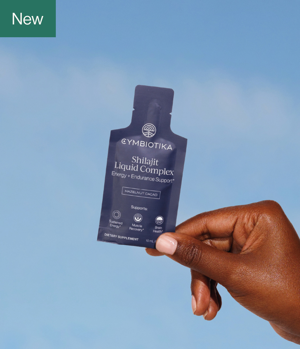
Photography Guidelines
GENERAL TONE
All photography should feel immediately recognizable as part of Cymbiotika's brand. The images should be
bright, clean, elevated, and cohesive, and emphasize wellness and freshness in each composition.


- Ensure front labels are centered, well-lit, and legible
- Smooth out creases in packet products where needed
- Aim to photograph products straight-on, directly overhead in a flat lay, or leaned against an object or vertical surface
- Avoid photographing products upside-down or rotated more than 45 degrees
- Ensure models' hands aren't covering the name of the product or the Cymbiotika logo
- Edit photographs with true-to-life color grading and white balance to represent products' colors accurately
When photographing Cymbiotika products:
Click individual image to expand
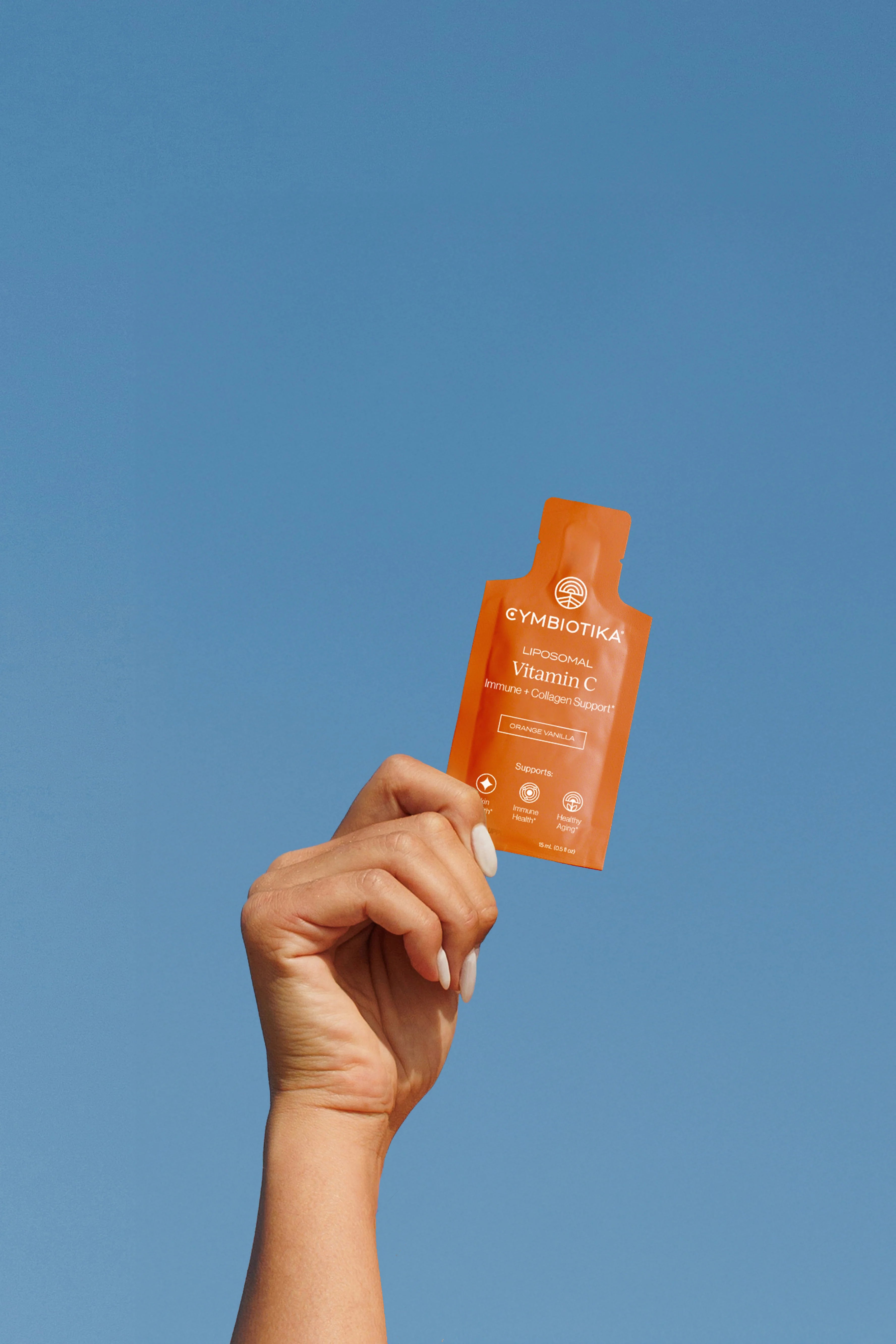
LIFESTYLE PHOTOGRAPHY
- Full, bright sun to achieve a cohesive hard light shadow across images
- Outdoor environments with primarily clean, minimal natural features such as ocean views, cliff faces, grassy hills, etc.
- Elevated, minimalist, modern interior spaces to best reflect the quality of the product. Edit out any distracting decor, outlets, cords, etc.
- Simple, refined, on-trend decor and props, and kept at a minimum to ensure focus on the product
- Models engaged in wellness-oriented movement, eg. yoga, walking in nature, or in a realistic at-home scene, eg. taking vitamins in the kitchen
- Wardrobe that doesn’t distract from the product; avoid overly-saturated colors, patterns, logos, or revealing clothing
- Models with optimistic and contented expressions
- Models with clean, trimmed, neat nails, and without visible tattoos
When photographing lifestyle imagery, prioritize:


Click individual image to expand
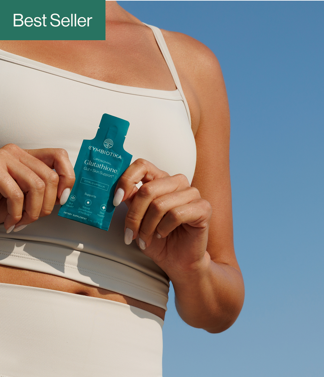
STUDIO PHOTOGRAPHY
- Bright light and primarily directional, crisp “hard light” shadows for consistency across studio images. If shooting with softer light, opt for a similarly bright and light look
- Artful, purposeful, and visually interesting compositions that are simultaneously clean, minimal, and elevated
- Simple props that add to and do not detract from the product
- Background colors that complement the colors of the product, with priority given to whites, jewel tones, and muted colors
- Fruits and other ingredients to highlight the products’ flavor profiles and convey their freshness
- Both static and dynamic images, eg. an orange being squeezed
- A human element, ie. a hand in frame
When photographing studio imagery, prioritize


Click individual image to expand
Photography Guidelines
GENERAL TONE
All photography should feel immediately recognizable as part of Cymbiotika's brand. The images should be bright, clean, elevated, and cohesive, and emphasize wellness and freshness in each composition.
When photographing Cymbiotika products:
- Ensure front labels are centered, well-lit, and legible
- Smooth out creases in packet products where needed
- Aim to photograph products straight-on, directly overhead in a flat lay, or leaned against an object or vertical surface
- Avoid photographing products upside-down or rotated more than 45 degrees
- Ensure models' hands aren't covering the name of the product or the Cymbiotika logo
- Edit photographs with true-to-life color grading and white balance to represent products' colors accurately

Photography Guidelines
LIFESTYLE PHOTOGRAPHY
When photographing lifestyle imagery, prioritize:
- Full, bright sun to achieve a cohesive hard light shadow across images
- Outdoor environments with primarily clean, minimal natural features such as ocean views, cliff faces, grassy hills, etc.
- Elevated, minimalist, modern interior spaces to best reflect the quality of the product. Edit out any distracting decor, outlets, cords, etc.
- Simple, refined, on-trend decor and props, and kept at a minimum to ensure focus on the product
- Models engaged in wellness-oriented movement, eg. yoga, walking in nature, or in a realistic at-home scene, eg. taking vitamins in the kitchen
- Wardrobe that doesn’t distract from the product; avoid overly-saturated colors, patterns, logos, or revealing clothing
- Models with optimistic and contented expressions
- Models with clean, trimmed, neat nails, and without visible tattoos

Photography Guidelines
STUDIO PHOTOGRAPHY
When photographing studio imagery, prioritize:
- Bright light and primarily directional, crisp “hard light” shadows for consistency across studio images. If shooting with softer light, opt for a similarly bright and light look
- Artful, purposeful, and visually interesting compositions that are simultaneously clean, minimal, and elevated
- Simple props that add to and do not detract from the product
- Background colors that complement the colors of the product, with priority given to whites, jewel tones, and muted colors
- Fruits and other ingredients to highlight the products’ flavor profiles and convey their freshness
- Both static and dynamic images, eg. an orange being squeezed
- A human element, ie. a hand in frame

Legal Guidelines
GENERAL
Our brand identity — including, but not limited to, our primary logo, wordmark, and brand mark is the intellectual property of Cymbiotika and protected by trademark and copyright law.
Our brand, a cornerstone of our success, is one of our most valuable assets. It’s crucial that we uphold its integrity. Whether you’re using our branding assets digitally or in print, please meticulously adhere to our Brand Guidelines.
DO'S AND DON'TS
- Make sure you spell our name correctly: CYMBIOTIKA
- Take the time to read and use our branding assets correctly, as outlined in these Brand Guidelines
- Do not modify or alter our brand identity in anyway, shape, or form
- Do not use our branding assets to state or imply any partnership or joint venture with Cymbiotika
If you have any legal questions concerning our Branding Guidelines, please have your legal team contact Adam Gislason, Chief Strategy Officer & General Counsel, email: adam@cymbiotika.com
Back to cart
CONGRATS
Choose Your Free Gift
As a thank-you for subscribing, choose one complimentary product below.
Are you sure?
We'll remind you before your next
Golden Mind order processes.
Golden Mind order processes.
We'll remind you before your next
Topical Magnesium order processes.
Topical Magnesium order processes.
Are you sure?
Removing will also remove the exclusive discounted item added to your
cart.
You're away from a FREE gift!
Add any of the products below to unlock your free gift.
You've unlocked a FREE gift!
Thanks for spending $110. Choose one of the three starter kits below.
Subscribe & Save


Trusted by 60k+ subscribers
Subscription benefits
- Get free shipping, every time
- Unlock rewards and get freebies
- Pause, skip, or cancel anytime


FOR YOU
One FREE Month of Golden Mind!
You've unlocked one FREE month of Golden Mind! Your subscription will renew automatically every
30 days, and we'll remind you before your order processes.
Cancel anytime in your portal.
FOR YOU
One FREE Month of Topical Magnesium Oil!
You've unlocked one FREE month of Topical Magnesium Oil! Your subscription will renew
automatically every 30 days, and we'll remind you before your order processes.
Cancel anytime in your portal.
Your Cart
( items)
Free shipping sitewide.


More subscriptions, more savings
1
30% off
2
34% off
3
38% off
4
40% off
5
40% off
Want to save? Add a subscription to get 30% off on it!
Your cart is currently empty.
You may also like. . .
Subtotal:
60-Day money back guarantee*